Material 是 Google 打造的設計系統,提供相關指南、元件,以及支援使用者介面設計最佳做法的工具。在本此篇文章中,我們將根據建議的 UI 最佳做法,更新小費計算機應用程式,確保使用者享有流暢的使用體驗。
學習目標
- 如何在應用程式中使用 Material Design 元件
- 如何從 Image Asset Studio 匯入 Material 圖示,使得可在應用程式中使用 Material 圖示
- 如何建立及套用新樣式
- 如何設定顏色以外的佈景主題屬性
範例應用程式總覽
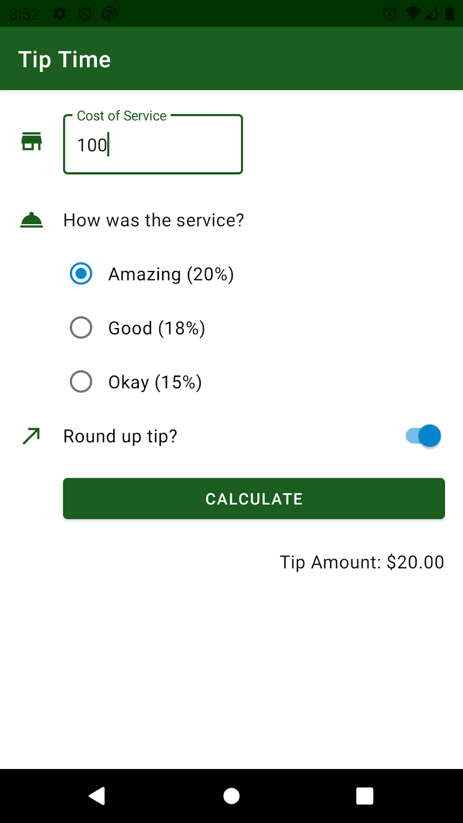
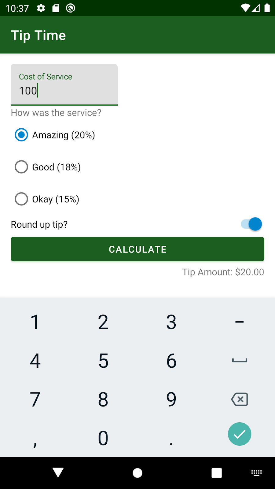
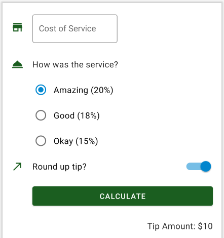
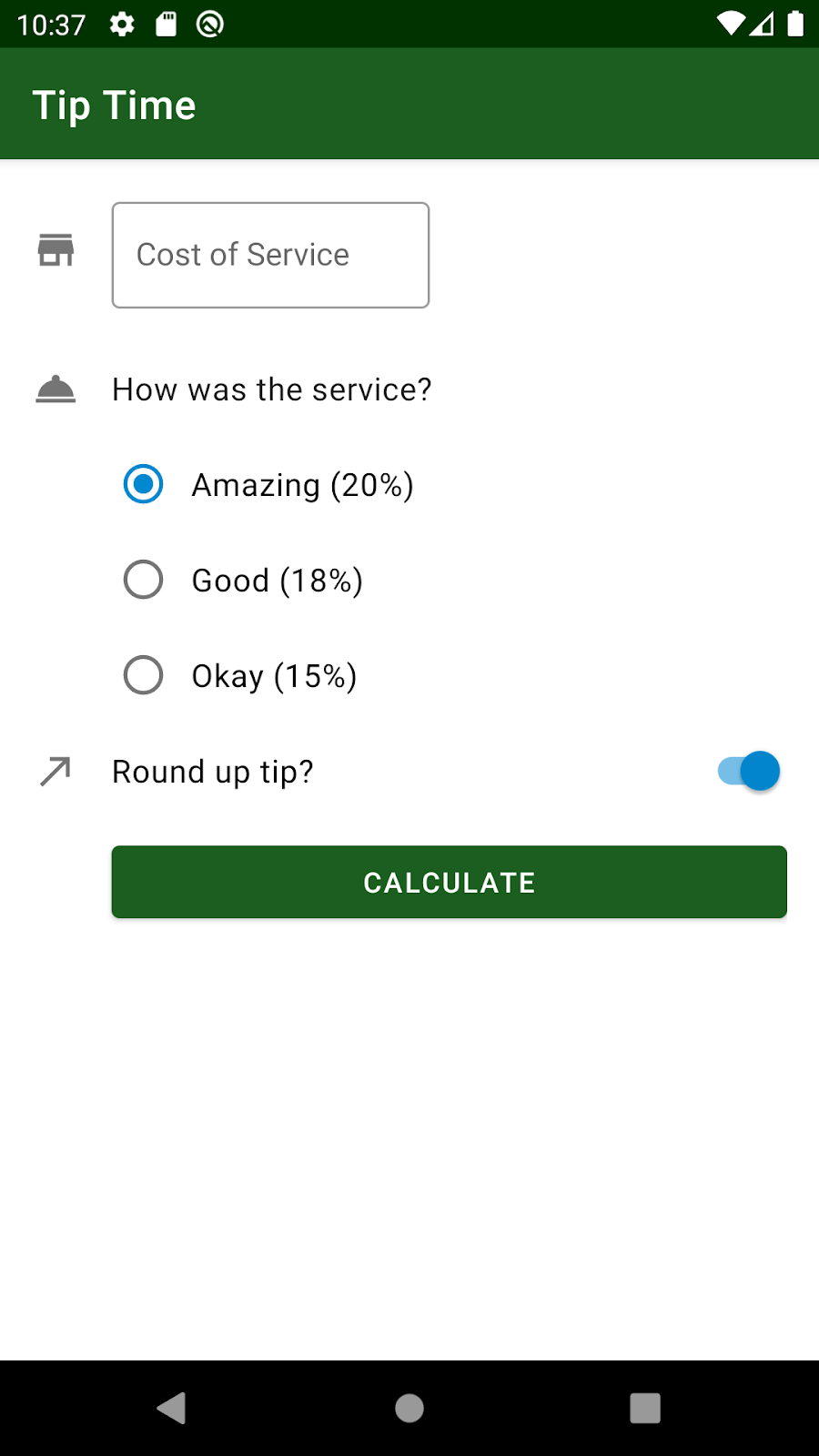
您在先前的程式碼研究室已建構 Tip Time 應用程式,這是一款小費計算機應用程式,且提供可自訂小費的選項。您的應用程式使用者介面看似像如下螢幕截圖。功能可以運作,但看起來更像原型。這些欄位看起來並未完全對齊。就提升樣式和間距的一致性,以及使用 Material Design 元件而言,肯定還有改進空間。
Material 元件
Material元件 (Material Components) 是常見的使用者介面小工具,可協助您輕鬆在應用程式中導入 Material 樣式。這份說明文件說明如何使用及自訂質感設計元件。每個元件都有通用的 Material Design 指南,而 Android 適用的元件則有 Android 平台專屬的指南。如果所選平台沒有某個元件,您可以從已加標籤的圖表取得充足資訊,重新建立該元件。
透過 Material Design Components(元件),您的應用程式能夠以更一致的方式,與使用者裝置上的其他應用程式搭配運作。如此一來,在某個應用程式中學到的使用者介面操作模式即可沿用到其他應用程式,這樣使用者就能更快瞭解如何使用您的應用程式。因此,建議您盡可能使用 Material Components,而非使用 Material 小工具。Material 元件更加靈活且可自訂,而且您將在下一個工作中學到這些知識。
您需要將 Material Design Components (MDC) 程式庫做為依附元件加入專案中。根據預設,您的專案應該已經包含這一行。請在應用程式的 build.gradle 檔案中,確認最新版程式庫包含這項依附元件。詳情請參閱 Material Design 網站的入門指南頁面。
app/build.gradle
1 | dependencies { |
文字欄位(Text Fields)
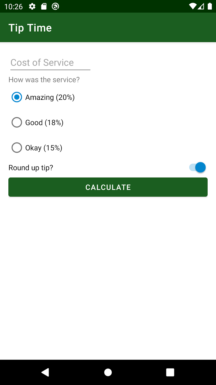
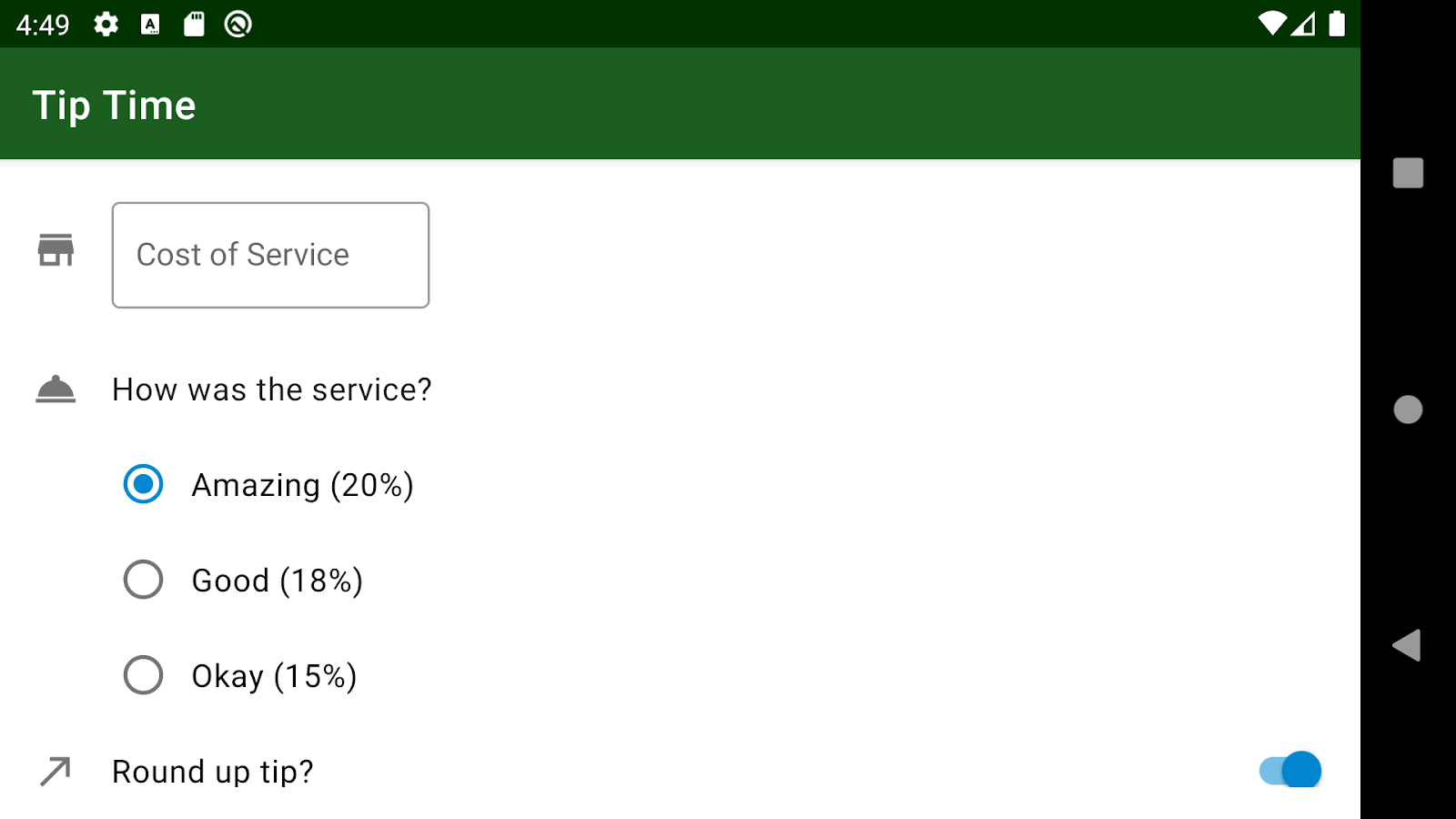
在小費計算機應用程式中,版面配置頂端會顯示目前服務費的 EditText 欄位。此 EditText 欄位可正常運作,但文字欄位的外觀和行為不符合最新質感設計南要求。
如果想使用新元件,請先在 Material Design 網站上瞭解相關資訊。根據文字欄位指南所述,文字欄位分成兩種類型:
實心的文字欄位(左)、含外框的文字欄位(右)。

若要建立上述文字欄位,請使用 MDC 程式庫中內含 TextInputEditText 的 TextInputLayout。您可以輕鬆自訂 Material Design 文字欄位,執行以下操作:
- 顯示始終可見的文字或標籤
- 在文字欄位中顯示圖示
- 顯示小幫手或錯誤訊息
在本程式碼研究室的第一項工作中,您要將服務費 EditText 替換為 Material Design 的text欄位 (由 TextInputLayout 和 TextInputEditText 所組成)。
在 Android Studio 中開啟 Tip Time 應用程式,前往
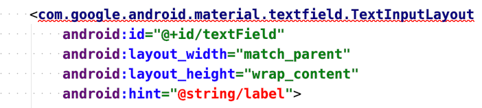
activity_main.xml版面配置檔案。其中應包含有小費計算機版面配置的ConstraintLayout。如要查看 Material Design text欄位的 XML 樣式示例,請返回text欄位的 Android 指南。您應該會看到類似下列內容的程式碼片段:
1 | <com.google.android.material.textfield.TextInputLayout |
- 看到這個示例後,請插入 Material Design 文字欄位做為
ConstraintLayout的第一個子項 (在EditText欄位前)。您將在後續步驟中移除EditText欄位。
1 |
|
您應該會看到 TextInputLayout 元素有錯誤。您尚未在父項 ConstraintLayout 中適當的限制此檢視畫面。系統也無法辨識字串資源。您會在後續步驟中修正這些錯誤。
- 在文字欄位中加入垂直和水平限制條件,以便正確放置於父項
ConstraintLayout中。您尚未刪除EditText,因此請從EditText剪下及貼上下列屬性,並加入TextInputLayout中:constraints、resource IDcost_of_service、160dp的版面配置寬度、wrap_content的版面配置高度,以及hint text@string/cost_of_service。
1 | ... |
畫面上可能會顯示錯誤訊息,指出 cost_of_service ID 與 EditText 的資源 ID 相同,但您目前可以忽略這項錯誤 (將用幾個步驟移除 EditText)。
- 接著確認
TextInputEditText元素具有所有適當的屬性。從EditText的輸入類型剪下並貼上至TextInputEditText。將TextInputEditText的 resource ID 變更為cost_of_service_edit_text。
1 | <com.google.android.material.textfield.TextInputLayout ... > |
保持原本 match_parent 的寬度和 wrap_content 的高度即可。設定 match_parent 的寬度時,TextInputEditText 的寬度會與父項 TextInputLayout 相同,也就是 160dp。
您現在已從
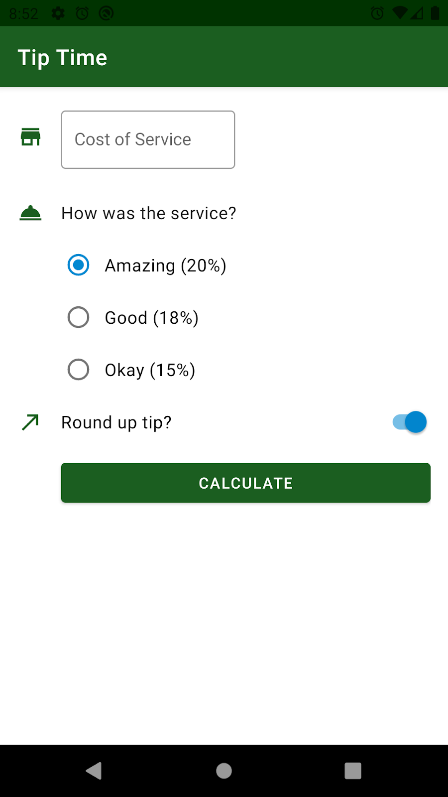
EditText複製所有相關資訊,請進一步刪除版面配置中的EditText。版面配置的「Design」檢視畫面應該會顯示以下預覽內容。「Cost of Service」欄位現在會以 Material Design 文字欄位的形式呈現。
您目前無法執行這個應用程式,因為 calculateTip() 方法的 MainActivity.kt 檔案發生錯誤。回顧先前的程式碼研究室,如果您的專案已啟用檢視區塊繫結(Binding),Android 會根據resource ID 名稱在繫結物件中建立屬性。擷取服務費的來源欄位已在 XML 版面配置中有所變更,因此 Kotlin 程式碼也需要隨之更新。
您現在將從resource ID 為 cost_of_service_edit_text 的 TextInputEditText 元素擷取使用者輸入內容。在 MainActivity 中,使用 binding.costOfServiceEditText 存取儲存於其中的文字字串。calculateTip() 方法的其餘部分則不受影響。
1 | private fun calculateTip() { |
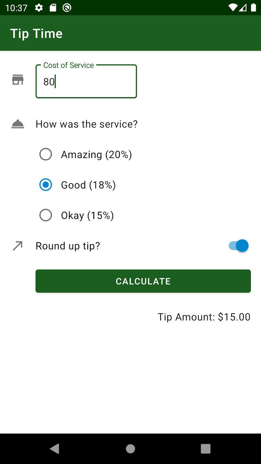
- 接著,執行應用程式並測試是否仍然正常運作。請注意,輸入時,「Cost of Service」標籤顯示在您輸入的內容上方的方式。小費仍會照常計算。
切換鈕(Switches)
Material Design 指南中也提供切換鈕的說明。切換鈕這種小工具可用來開啟或關閉設定。
請參閱 Android 指南以瞭解 Material 的切換按鈕。您將會瞭解提供切換鈕 Material 樣式的 SwitchMaterial 小工具 (來自 MDC 程式庫)。如果您持續捲動瀏覽指南,就會看到 XML 範例。
若要使用
SwitchMaterial,您必須在版面配置中明確指定SwitchMaterial,且使用完整的路徑名稱。
在 activity_main.xml 版面配置中,將 XML 標記從 Switch 變更為 com.google.android.material.switchmaterial.SwitchMaterial。
1 | ... |
- 執行應用程式,確認應用程式是否仍可編譯。應用程式沒有明顯異動。不過,使用 MDC 程式庫中的
SwitchMaterial(而非 Android 平台的 Switch) 的好處便是當更新SwitchMaterial程式庫的實作時 (例如質感設計指南變更),您不需要執行變更,就能免費取得更新版小工具。這有助於應用程式永不過時。
現在您已看到兩個例子,瞭解使用現成的 Material Design 元件對使用者介面有何好處,也明白這種做法如何讓應用程式更符合 Material Design 指南。請注意,您隨時可以前往這個網站,探索 Android 提供的其他 Material Design 元件。
圖示(Icons)
圖示(Icons)是一種符號,可透過視覺呈現的方式協助使用者瞭解使用者介面的預定功能,而且通常會以使用者預期在實體世界遇到的物體為靈感。圖示設計往往會將詳細資料精細程度降至供使用者熟悉所需的最低程度。舉例來說,現實生活中的鉛筆是用來寫字,因此對應的圖示通常表示建立、新增或編輯項目。
在應用程式中呈現圖示
就應用程式中的圖示而言,建議您採用向量可繪項目,而不是針對不同螢幕密度提供不同版本的點陣圖圖像。向量可繪項目是以 XML 檔案表示,用於儲存如何建立圖像的操作說明,而非儲存組成該圖像的實際像素。向量可繪項目可以任意縮放,而不會減損圖像品質或增加檔案大小。
提供的圖示
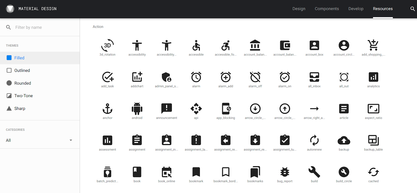
Material Design 提供多種圖示,並依常見類別排列,方便您視需求選擇使用。查看圖示清單。
繪製這些圖示時,也可以使用實心、含外框、圓角、雙色和銳利這五種主題,並加上顏色。
| 實心 | 含外框 | 圓角 | 雙色 | 銳利 |
|---|---|---|---|---|
 |
 |
 |
 |
 |
新增圖示
在這項工作中,您要在應用程式中新增三個向量可繪項目圖示:
- 服務費文字欄位旁邊的圖示
- 服務問題旁邊的圖示
- 小費四捨五入提示旁邊的圖示
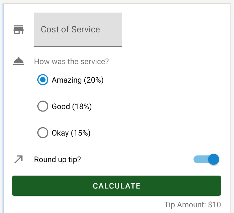
以下是應用程式最終版本的螢幕截圖。新增圖示後,您將配合這些圖示的位置調整版面配置。請注意,新增圖示會造成欄位和計算按鈕向右移動
新增向量可繪項目素材資源
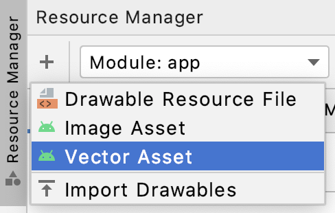
您可以直接在 Android Studio 的 Asset Studio 中建立這些圖示,做為向量可繪項目。
開啟應用程式視窗左側的「Resource Manager」分頁。
按一下「+」圖示,然後選取「Vector Asset」。
- 確認已選取「Asset Type」中標示「Clip Art」的圓形按鈕。
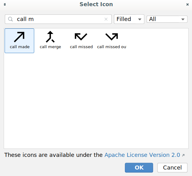
- 按一下「Clip Art:」旁的按鈕,選取其他插圖圖像。在隨即顯示的提示中,在顯示的視窗中輸入「”call made」。您將使用這個箭頭圖示來代表「round up tip」選項。請選取該圖示,然後點選「OK」。
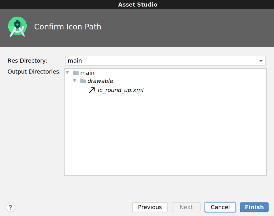
將圖示重新命名為
ic_round_up。在為圖示檔案命名時,建議使用前置字串 ic_。將「Size」保留為24 dp x 24 dp,並將「Color」保留為黑色000000。按一下「Next」。
接受預設目錄位置,然後按一下「Finish」。
- 針對另外兩個圖示重複步驟 2 到 7:
- 服務問題圖示:搜尋「room service」圖示,並將其儲存為
ic_service。 - 服務費圖示:搜尋「store」圖示,並將其儲存為
ic_store。
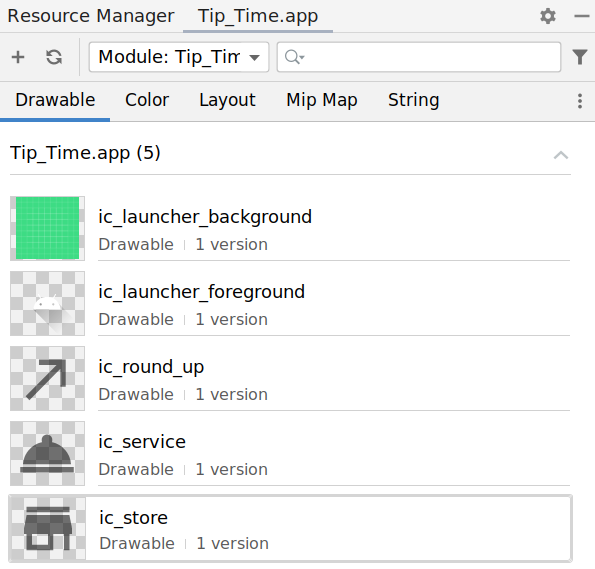
- 完成後,「Resource Manager」分頁會顯示以下螢幕截圖所列的畫面。此外,
res/drawable資料夾也會列出三個向量可繪項目,即ic_round_up、ic_service和ic_store。
支援舊版 Android
您剛剛在應用程式中新增了向量可繪項目,但請特別注意,Android 5.0 (API 級別 21) 版本之前的 Android 平台不支援向量可繪項目。
根據專案設定方式,Tip Time 應用程式的最低 SDK 版本為 API 19。這表示該應用程式可以在執行 Android 平台 19 以上版本的 Android 裝置上執行。
如要讓您的應用程式在舊版 Android 裝置上運作 (稱為回溯相容性),請在應用程式的 build.gradle 檔案中新增 vectorDrawables 元素。這樣您就能在 API 21 以下版本的平台上使用向量可繪項目,而不需要在建構專案時轉換成 PNG。詳情請參閱這個頁面。
app/build.gradle
1 | android { |
插入圖示和位置元素
您將使用 ImageViews 在應用程式中顯示圖示。這是最終顯示 UI 的方式。
開啟
activity_main.xml版面配置。先找出服務費文字欄位旁邊的商店圖示。在
TextInputLayout前插入新的ImageView,做為ConstraintLayout的第一個子項。
1 | <androidx.constraintlayout.widget.ConstraintLayout |
- 在
ImageView上設定適當的屬性來保留ic_store圖示。將 ID 設定為icon_cost_of_service。將android:src屬性設定為可繪製資源@drawable/ic_store,而 XML 該行旁邊會顯示圖示的預覽。
此外,由於圖片僅用於裝飾用途,請設定android:importantForAccessibility="no"。
1 | <ImageView |
ImageView 應該會出現錯誤,因為檢視區塊尚未受到限制。接下來,您將修復此問題。
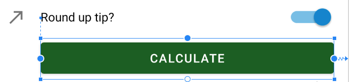
- 以兩個步驟定位
icon_cost_of_service。首先新增ImageView的限制 (此步驟),然後更新旁邊TextInputLayout的限制 (步驟 5)。下圖說明設定限制條件的方式。
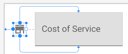
在 ImageView 上,您想要將起始邊緣限制為父項檢視畫面 (app:layout_constraintStart_toStartOf="parent") 的起始邊緣。
比起旁邊的文字欄位,該圖示看起來是垂直置中,因此應將此 ImageView 的頂端 (layout_constraintTop_toTopOf) 限制在文字欄位頂端,並將此 ImageView 的底部 (layout_constraintBottom_toBottomOf) 限制為文字欄位的底部。如要參照文字欄位,請使用資源 ID @id/cost_of_service。預設行為是指將兩個限制條件套用至相同維度 (例如頂端和底部限制條件) 的小工具時,系統會同樣套用這兩個限制條件。這會讓圖示以服務費欄位為基準垂直置中。
1 | <ImageView |
在「Design」檢視畫面中,圖示和文字欄位仍會重疊。這將在下一個步驟中修正。
- 新增圖示前,文字欄位定位於父項的開頭,現在,必須移到右側。請更新
cost_of_service文字欄位與icon_cost_of_service相關的限制條件。
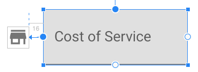
TextInputLayout 的起始邊緣應限制為 ImageView 的結束邊緣 (@id/icon_cost_of_service)。若要在兩個檢視畫面之間加入間距,請在 TextInputLayout 上加入 16dp 的起始邊界。
1 | <com.google.android.material.textfield.TextInputLayout |
完成上述所有變更後,圖示應正確放置在文字欄位旁邊。
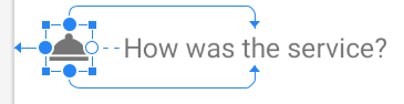
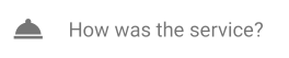
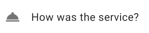
- 接著在「How was the service?」旁插入服務鈴鐺圖示
TextView。雖然您可以在ConstraintLayout內的任何位置宣告ImageView,但如果在 XML 版面配置中的TextInputLayout後方、service_question TextView前方插入新ImageView,XML 版面配置會更清楚易懂。
為新的 ImageView 指派 @+id/icon_service_question 資源 ID。針對 ImageView 和服務問題 TextView 設定適當的限制條件。
此外,請為 service_question TextView 加上 16dp 邊界,讓服務問題與上方的服務費欄位之間有更多垂直空間。
1 | ... |
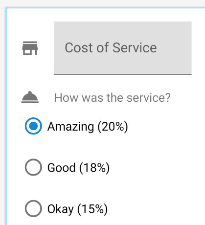
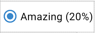
- 此時,「Design」檢視畫面應如下圖所示。「Cost of Service」欄位和服務問題 (以及各自的圖示) 看起來很清楚,但圓形按鈕的位置並不適當,而且不會與上方的內容垂直對齊。
- 將圓形按鈕向右移至服務問題下方,改善圓形按鈕的位置。這表示更新
RadioGroup限制條件。將RadioGroup的起始邊緣限制為service_question TextView的起始邊緣。RadioGroup上的所有其他屬性都將維持不變。
1 | ... |
接下來,請將
ic_round_up的圖示加到「Round up tip?」切換鈕旁的版面配置。請嘗試自行完成此操作,如果遇到困難,可以參考下方的 XML。您可以將新的 ImageView 資源 ID 指派給icon_round_up。在版面配置 XML 中的
RadioGroup後方、SwitchMaterial小工具前方插入新ImageView。指派
icon_round_up的資源 ID 給ImageView,然後將src設為圖示@drawable/ic_round_up的可繪項目。請將ImageView的開頭限制為父項的開頭,並讓圖示以SwitchMaterial為基準垂直置中。更新
SwitchMaterial,將其放於圖示旁邊,並將起始邊界設為16dp。針對icon_round_up和round_up_switch產生的 XML 應如下所示。
1 | ... |
- 「Design」檢視畫面應如下圖所示。這三個圖示均已正確定位。
- 如果比較此畫面與最終的應用程式螢幕截圖,就會發現計算按鈕也會移動,並垂直對齊服務費欄位、服務問題、圓形按鈕選項和小費四捨五入問題。只要將「Calculate」按鈕的起始位置限制為
round_up_switch的起始位置,就能達到此效果。此外,在計算按鈕與上方切換鈕之間,也會加入8dp垂直邊界。
1 | ... |
- 最後,也務必為
TextView的上邊界增加8dp,設定tip_result的位置。
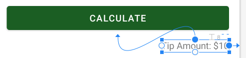
1 | ... |
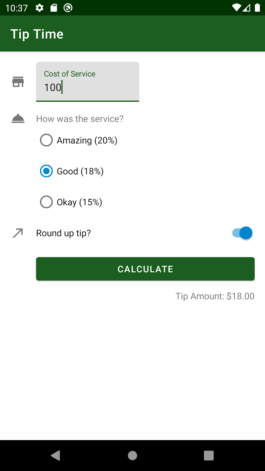
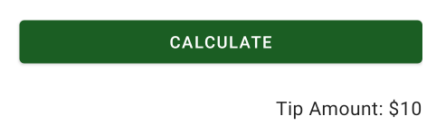
- 執行應用程式,畫面應該看起來像下方的螢幕截圖。使元素垂直對齊並增加元素之間的間距,這些元素就不會擁擠。
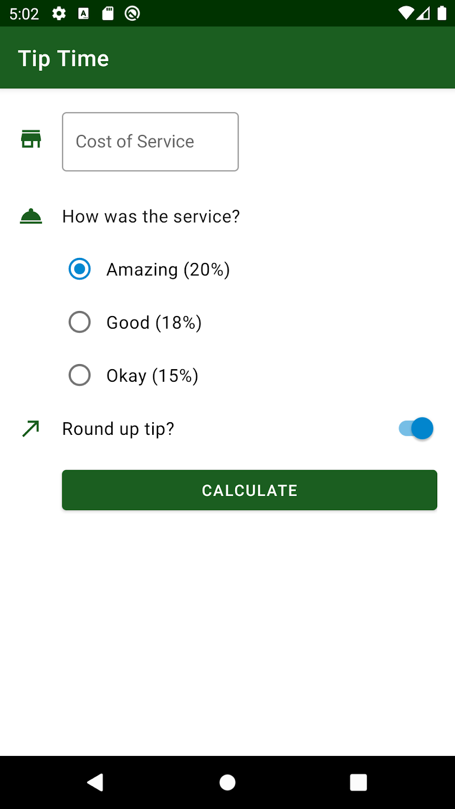
我的實作畫面:
樣式與主題(Styles and Themes)
樣式(style)是單一類型小工具的檢視畫面屬性值集合。舉例來說,TextView 樣式可指定字型顏色、字型大小和背景顏色等。只要將這些屬性擷取為樣式,就能輕鬆將樣式套用至版面配置的多個檢視畫面,並在同一處維護樣式。
在這項工作中,您要先建立文字檢視區塊、圓形按鈕和切換鈕小工具的樣式。
建立樣式
如果在「res > values」目錄沒有名為 styles.xml 的新檔案,請建立該檔案。在「values」目錄上按一下滑鼠右鍵,然後依序選取「New」>「Values Resource File」,即可建立檔案。呼叫 styles.xml。新檔案包含下列內容。
1 |
|
- 建立新的
TextView樣式,使整個應用程式中的文字保持一致。只需在styles.xml中定義樣式一次,就能將該樣式套用至版面配置中的所有TextViews。雖然您可以從頭開始定義樣式,但您可以從 MDC 程式庫中現有的TextView樣式延伸。
設定元件樣式時,一般而言,您應從所用小工具類型的父項樣式中延伸。這麼做有兩個非常重要的理由:第一是確認已在元件中設定所有重要的預設值,第二是樣式會持續繼承日後的父項樣式變更。
您可以視需要為樣式命名,但建議採用以下慣例。若是繼承父項 Material 樣式,請將 MaterialComponents 替換成您的應用程式名稱 (TipTime),藉此以類似方式命名樣式。這麼做會將您的變更移到各自的命名空間,進而避免在 Material 元件日後推出新樣式時發生衝突。示例:
您的樣式名稱 Widget.TipTime.TextView 繼承父項樣式 Widget.MaterialComponents.TextView
請此內容加至 styles.xml 檔案中 resources 的開頭標記與結尾標記之間。
1 | <style name="Widget.TipTime.TextView" parent="Widget.MaterialComponents.TextView"> |
- 設定
TextView樣式,使其會覆寫屬性android:minHeight,android:gravity, 和android:textAppearance.
android:minHeight 設定 TextView 上的高度下限為 48dp。根據 Material Design 指南的規定,任一列的最小高度應為 48 dp。
設定 android:gravity 屬性就可將 TextView 中的文字垂直置中。(請參閱下方的螢幕截圖。)重力可控制檢視畫面中內容本身的定位方式。由於實際文字內容的高度不會佔據整個 48dp,所以 center_vertical 值會將 TextView 內的文字垂直置中 (但不變更水平位置)。其他可能的重力值包括 center、center_horizontal、top 和 bottom。歡迎嘗試其他重心值,瞭解這對文字的影響。
將文字外觀屬性值設為 ?attr/textAppearanceBody1。TextAppearance 是一組預先製作的樣式,用於文字大小、字型和其他文字屬性。如要查看 Material Design 提供的其他可用文字外觀,請參閱字體排版比例清單。
1 | <style name="Widget.TipTime.TextView" parent="Widget.MaterialComponents.TextView"> |
- 在
activity_main.xml的每個TextView上新增樣式屬性,即可將Widget.TipTime.TextView樣式套用到service_question TextView。
1 | <TextView |
- 在新增此樣式前,
TextView的字型看起來很小,且字型顏色是灰色:
- 新增樣式之後,
TextView外觀如下。現在,TextView看起來與版面配置的其餘部分更一致。
將相同的 Widget.TipTime.TextView 樣式套用到 tip_result TextView。
1 | <TextView |
- 相同的文字樣式應套用至切換按鈕中的文字標籤。不過,您無法將
SwitchMaterial小工具設定為TextView樣式。TextView樣式只能套用到TextViews。因此需要建立用於切換按鈕的新樣式。屬性的minHeight、gravity和textAppearance皆相同。差別在於樣式名稱與父項不同,因為您現在要繼承 MDC 程式庫的Switch樣式。樣式名稱也應與父項樣式名稱相同。
您的樣式名稱 Widget.TipTime.CompoundButton.Switch 繼承父項樣式 Widget.MaterialComponents.CompoundButton.Switch.
1 | <style name="Widget.TipTime.CompoundButton.Switch" parent="Widget.MaterialComponents.CompoundButton.Switch"> |
- 如果想讓文字視覺效果保持一致,圓形按鈕是最後一項需要留意的元素。您無法將
TextView樣式或Switch樣式套用至RadioButton小工具。而是,您必須建立用於圓形按鈕的新樣式。您可以從 MDC 程式庫的RadioButton樣式延伸。
建立此樣式時,也在圓形按鈕文字與圓形影像內容之間加入邊框間距。paddingStart 是您尚未使用的新屬性。邊框間距是指檢視區塊內容與檢視區塊邊界之間的空間大小。paddingStart 屬性只會在元件的開頭設定邊框間距。以下是圓形按鈕的 paddingStart 分別設為 0 dp 與 8 dp 的差異。
1 | <style name="Widget.TipTime.CompoundButton.RadioButton" |
- (選用) 建立
dimens.xml檔案以更方便管理常用值。您可以採用與上述styles.xml檔案相同的方式建立檔案。選取「values」目錄、按一下滑鼠右鍵,然後依序選取「New」>「Values Resource File」。
在這個小型應用程式中,您重複設定最小高度兩次。目前當然可以管理,但要是有 4 個、6 個、10 個或更多個元件共用相同的值,就會迅速失控。記住逐一變更每個項目的做法不僅繁瑣,而且容易出錯。您可以依序點選「res」>「values」,建立另一個名為 dimens.xml 的實用資源檔案,保留可命名的常用尺寸。將常用值標準化為已命名的尺寸,就能更輕鬆管理應用程式。TipTime 很小,因此我們不會在此選用步驟外使用此應用程式。不過,如果您在正式環境中擁有較複雜的應用程式,且可能會與設計團隊合作,則 dimens.xml 可讓您輕鬆地頻繁變更這些值。
1 | <resources> |
與其直接設定 48dp,您可以改為更新 styles.xml 檔案,使用 @dimen/min_text_height。
1 | ... |
將這些樣式加入您的佈景主題
您可能已經注意到,您尚未將新的 RadioButton 和 Switch 樣式套用至各別的小工具。這是因為您需要使用佈景主題屬性來設定應用程式佈景主題中的 radioButtonStyle 和 switchStyle。讓我們複習一下何為主題。
佈景主題是一組具名資源 (名為佈景主題屬性),方便之後在樣式、版面配置等中參照。您可以指定整個應用程式、活動或檢視區塊階層的佈景主題,而不只是指定個別 View。您先前在 themes.xml 中設定了 colorPrimary 和 colorSecondary 等佈景主題屬性,藉此修改應用程式的佈景主題,然後在應用程式和其元件中使用這些佈景主題。
radioButtonStyle 和 switchStyle 是其他可設定的主題屬性。您為這些佈景主題屬性提供的樣式資源,會套用至每個圓形按鈕以及佈景主題所套用的檢視區塊階層中的每個切換按鈕。
此外,還有適用於 textInputStyle 的主題屬性,當中指定的樣式資源會套用至應用程式中的所有文字輸入欄位。如要讓 TextInputLayout 呈現加上外框的文字欄位外觀 (如 Material Design 指南所述),可以使用 MDC 程式庫中定義為 Widget.MaterialComponents.TextInputLayoutOutlinedBox 的 OutlinedBox 樣式。這是您將使用的樣式。
- 修改
themes.xml檔案,讓主題參照所需樣式。設定佈景主題屬性的方式與先前在程式碼研究室中宣告colorPrimary和colorSecondary佈景主題屬性的方式相同。不過,相關的佈景主題屬性為textInputStyle、radioButtonStyle和switchStyle。您會使用先前為RadioButton和Switch建立的樣式,以及 MaterialOutlinedBox的文字欄位的樣式。
將下列內容複製到 res/values/themes.xml 而複製到應用程式佈景主題的樣式標記。
1 | <item name="textInputStyle">@style/Widget.MaterialComponents.TextInputLayout.OutlinedBox</item> |
res/values/themes.xml檔案看起來會像這樣。您可以視需要在 XML 中加入註解 (以<!--和-->表示)。
1 | <resources xmlns:tools="http://schemas.android.com/tools"> |
- 請務必對
themes.xml (night)中的深色佈景主題進行相同變更。您的res/values-night/themes.xml檔案看起來會像這樣。
1 | <resources xmlns:tools="http://schemas.android.com/tools"> |
- 執行應用程式並查看變更。文字欄位的
OutlinedBox樣式看起來更好,所有文字現在看起來都一致!
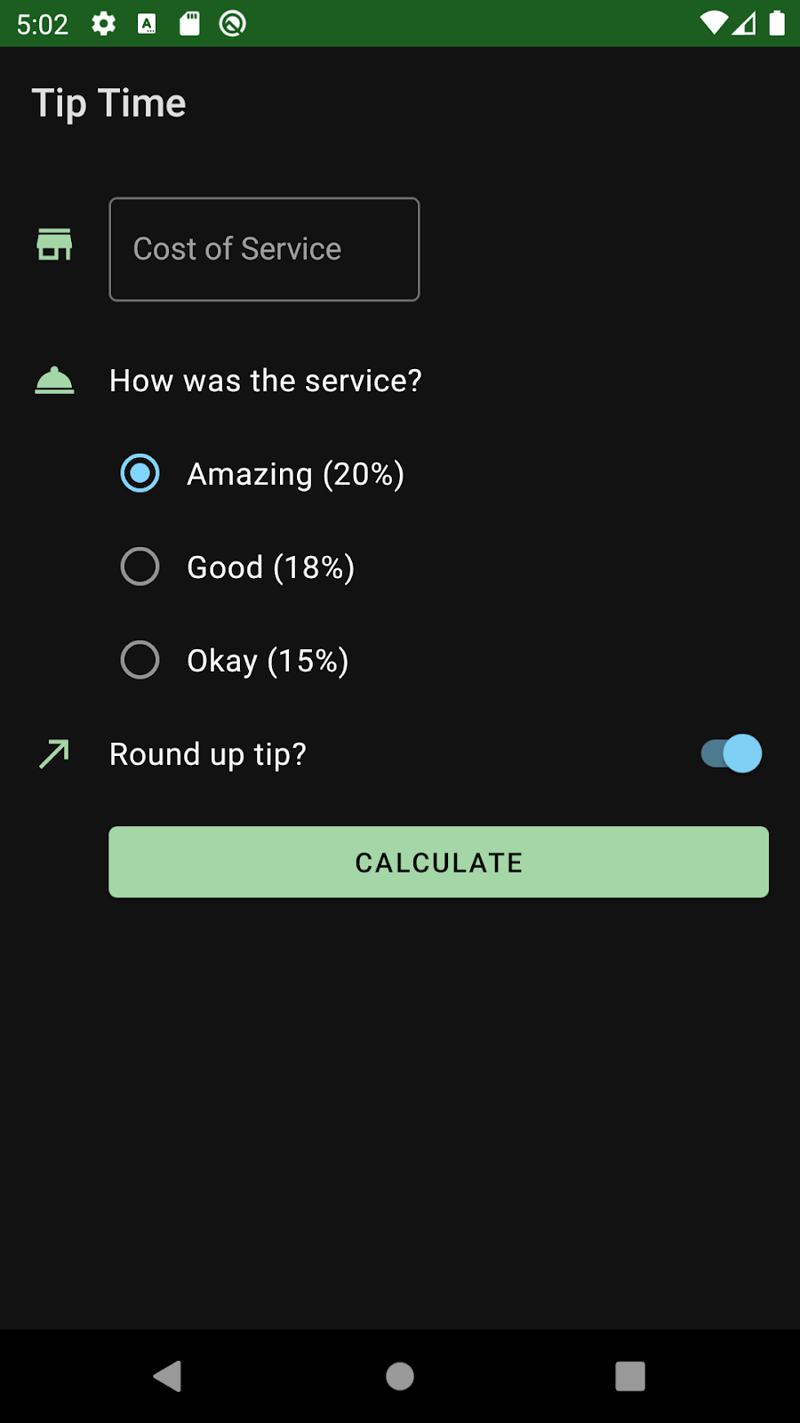
我的實作畫面:


加強使用者體驗
隨著您即將完成應用程式,除了應該使用預期的工作流程測試應用程式外,也應在其他使用者情境中進行測試。您可能會發現,稍微修改程式碼就能大幅提升使用者體驗。
旋轉裝置
- 旋轉裝置,切換為橫向模式。您可能需要先啟用「自動旋轉」設定,這項設定位於裝置的「快速設定」選單中。此外,也可以依序前往「設定」>「螢幕」>「進階」,就能找到「自動旋轉螢幕」選項。
在模擬器中,您可以使用靠近裝置右上角的模擬器選項,將畫面向右或向左旋轉。

- 您會發現部分使用者介面元件 (包括「Calculate」按鈕) 遭到截斷。這顯然使您無法使用應用程式!
- 若要解決這個問題,請在
ConstraintLayout四周加入ScrollView,然後執行Reformat code。您的 XML 看起來有些像這樣。
1 | <ScrollView |
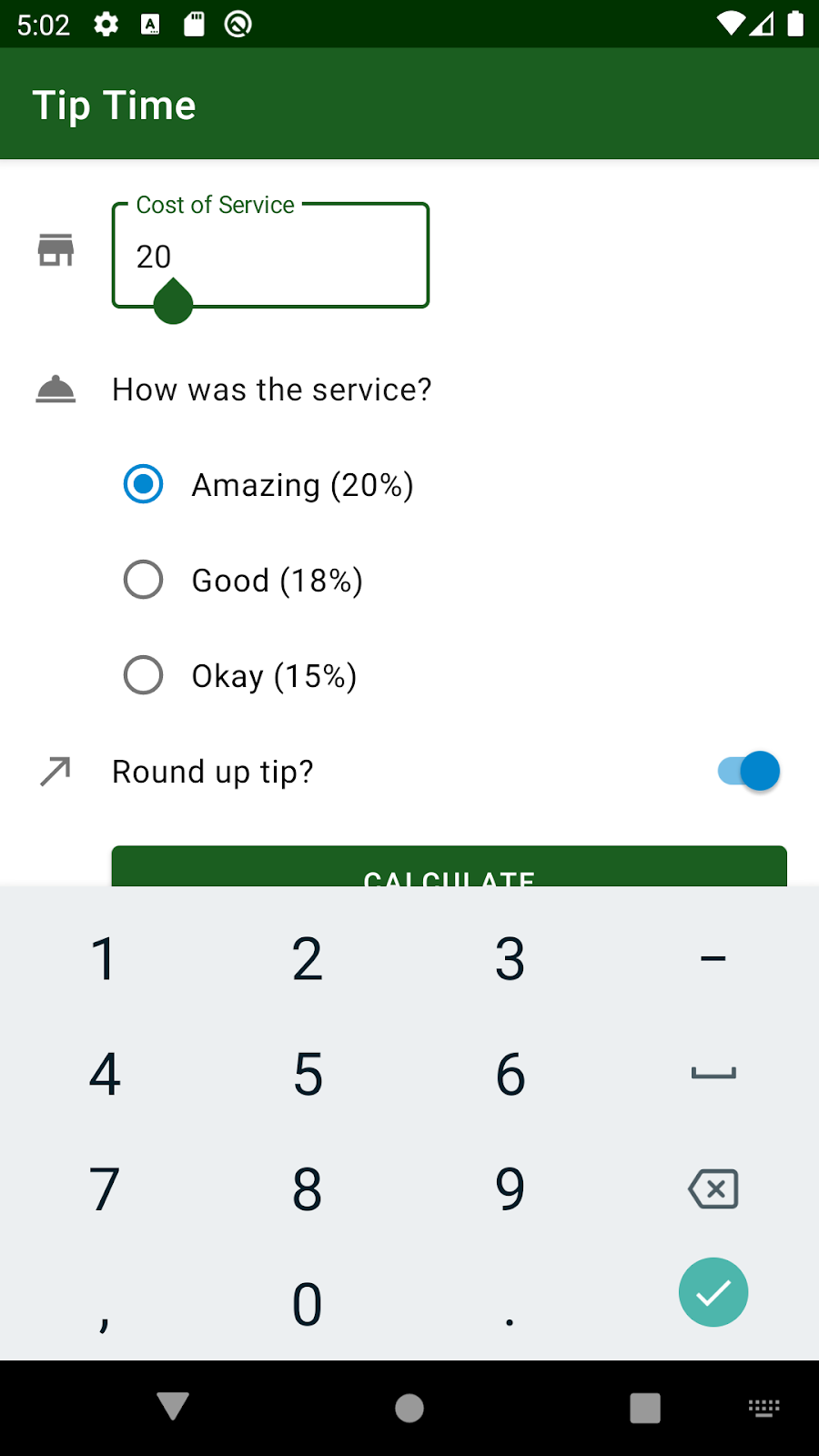
- 再次執行並測試應用程式。將裝置旋轉為橫向模式時,您應能捲動 UI 來存取計算按鈕,並查看小費計算結果。此修正功能不僅可用於橫向模式,而且也適用於其他不同尺寸的 Android 裝置。現在無論裝置螢幕大小為何,使用者都可以捲動瀏覽版面配置。

按下 Enter 鍵隱藏鍵盤
您可能已注意到,輸入服務費後,鍵盤仍會保持顯示狀態。每次使用「calculate」按鈕都需要手動隱藏鍵盤會有點麻煩。改為按下 Enter 鍵時,讓鍵盤自動隱藏。
您可以定義文字欄位的鍵事件監聽器,使得可回應於使用者輕觸特定按鍵的事件。鍵盤上每個可能的輸入項目選項都有相關聯的按鍵碼,包括 Enter 鍵。請注意,螢幕小鍵盤 (又稱為螢幕鍵盤) 與實體鍵盤不同。
在這項工作中,您要在文字欄位中設定按鍵事件監聽器,用於監聽使用者何時按下 Enter 鍵。偵測到這項事件後,就要隱藏鍵盤。
複製以下輔助方法,並貼到 MainActivity 類別中。您可以插入在 MainActivity 類別的大括號之前。handleKeyEvent() 是一種私人輔助函式,可以在 keyCode 輸入參數等於 KeyEvent.KEYCODE_ENTER 時隱藏螢幕小鍵盤。InputMethodManager 可控制是否要顯示螢幕鍵盤、隱藏螢幕鍵盤,及讓使用者能夠自行選擇要顯示的螢幕鍵盤。如果系統處理了按鍵事件,此方法會傳回 true,否則會傳回 false。
MainActivity.kt
1 | private fun handleKeyEvent(view: View, keyCode: Int): Boolean { |
- 現在,請在
TextInputEditText小工具上附加按鍵事件監聽器。請記住,您可以透過binding.costOfServiceEditText等繫結物件存取TextInputEditText小工具。
請在 costOfServiceEditText 上呼叫 setOnKeyListener() 方法,然後傳入 OnKeyListener。這個做法類似在應用程式中使用 binding.calculateButton.setOnClickListener { calculateTip() },設定「calculate」按鈕點擊事件監聽器。
在檢視畫面上設定按鍵事件監聽器的程式碼較為複雜,但大致來說,OnKeyListener 具有可在使用者按下按鍵時觸發的 onKey() 方法。onKey() 方法採用 3 個輸入引數:檢視畫面、已按下按鍵的程式碼,及按鍵事件 (您不會用到,因此您可以將其稱作「_」)。呼叫 onKey() 方法時,應呼叫 handleKeyEvent() 方法,並傳遞檢視畫面和按鍵碼引數。編寫此功能的語法為 view, keyCode, _ -> handleKeyEvent(view, keyCode)。其實這種語法稱為 lambda 運算式,您將在後續單元中進一步瞭解 lambda。
請新增程式碼,設定活動 onCreate() 方法內文字欄位的按鍵事件監聽器。這樣一來,就能在建立版面配置後,以及使用者開始與活動互動前,立即附加按鍵事件監聽器。
MainActivity.kt
1 | override fun onCreate(savedInstanceState: Bundle?) { |
- 測試新的變更是否正常運作。執行應用程式並輸入服務費。按下鍵盤上的 Enter 鍵就會隱藏螢幕鍵盤。
(選用) 調整向量可繪項目的色調
在此選用工作中,您將依據主題的主要顏色為圖示上色,讓淺色主題和深色主題中的圖示看起來不同 (如下所示)。這項變更是為了美化 UI,使圖示更貼合應用程式主題。
如先前所述,與點陣圖圖像相比,VectorDrawables 的優點之一就是能夠縮放圖像及上色。下方的 XML 代表鈴鐺圖示。請留意 android:tint 和 android:fillColor 這兩種顏色屬性。
ic_service.xml
1 | <vector xmlns:android="http://schemas.android.com/apk/res/android" |

如果有色調,則會覆寫可繪項目的任何 fillColor 指令。在這種情況下,系統會用 colorControlNormal 佈景主題屬性覆寫白色顏色。colorControlNormal 是小工具的「一般」(未選取/未啟用狀態) 顏色。目前是灰色。
我們針對應用程式執行的一項視覺強化操作,就是根據應用程式佈景主題的主要顏色為可繪項目調色。在淺色主題中,圖示會顯示為 @color/green;在深色主題中,圖示則會顯示為 @color/green_light,也就是 ?attr/colorPrimary。根據應用程式主題的主要顏色為可繪項目上色,可以讓版面配置中的元素看起來更融合一致。這樣也不必複製淺色主題和深色主題的各組圖示。只要準備 1 組向量可繪項目就好,而且色調會根據 colorPrimary 主題屬性而改變。
- 變更 ic_service.xml 中 android:tint 屬性的值
1 | android:tint="?attr/colorPrimary" |
在 Android Studio 中,圖示現在有適當的色調。
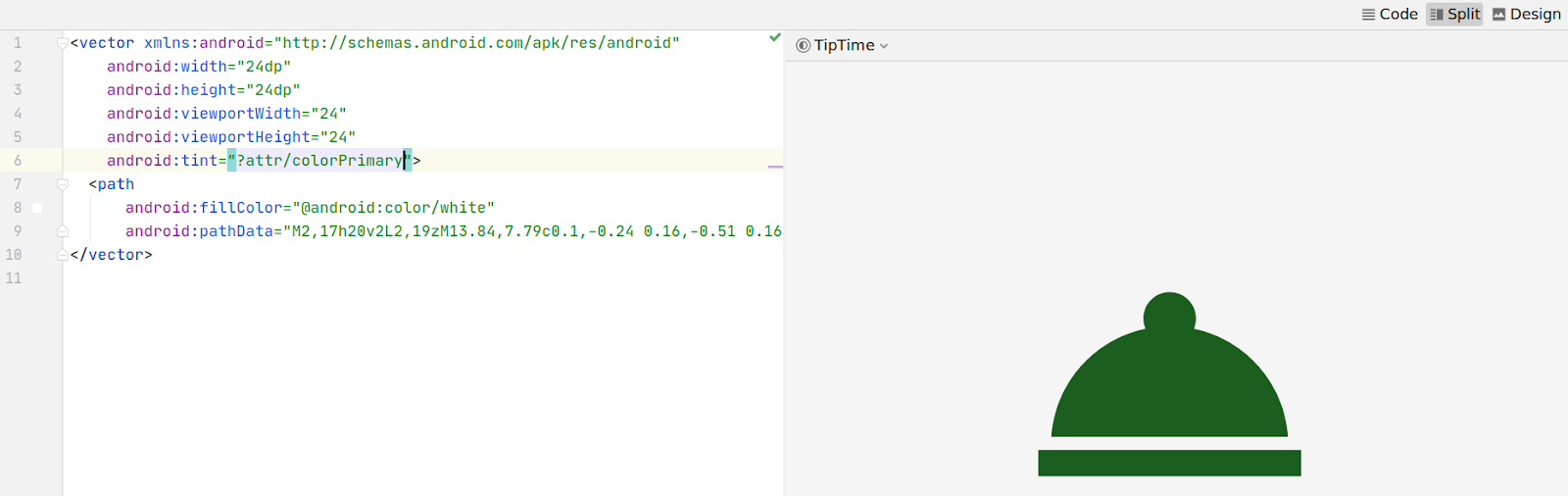
colorPrimary 主題屬性指向的值會因淺色主題和深色主題而有所不同。
- 重複上述步驟,變更其他向量可繪項目的色調
ic_store.xml
1 | <vector ... |
ic_round_up.xml
1 | <vector ... |
執行應用程式,確認圖示在淺色和深色主題中的顯示方式不同。
作為最後的清理步驟,請記得重新設定應用程式中所有 XML 和 Kotlin 程式碼檔案的格式。
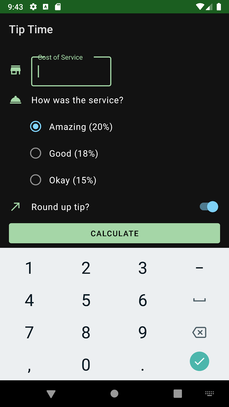
我的實作畫面:

